
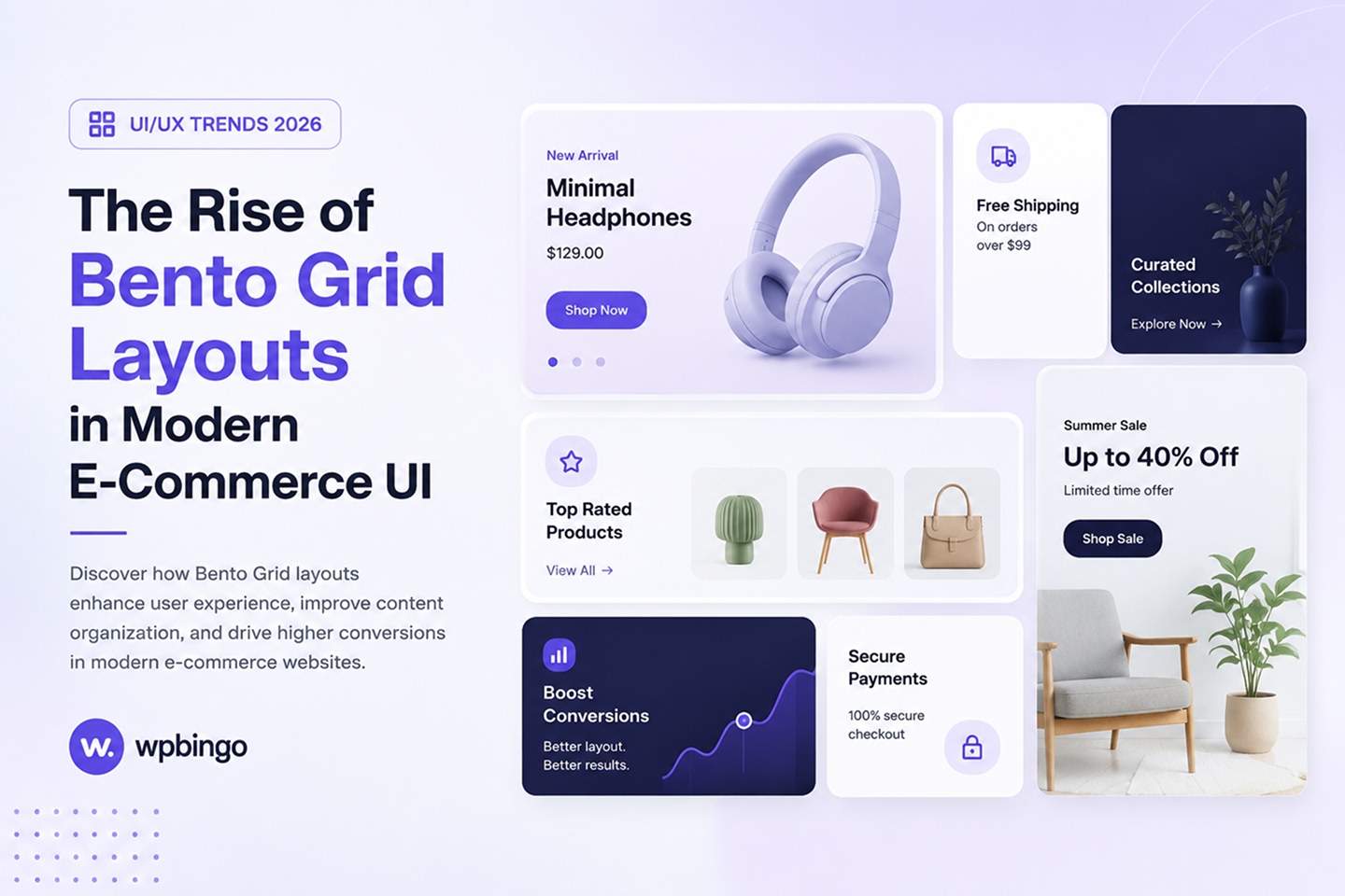
Implementing a modern bento grid layout is the single most effective way to elevate an e-commerce storefront today. Open any cutting-edge e-commerce homepage and you’ll notice something has changed. The neat, identical rows of product cards are giving way to something more dynamic—a patchwork of differently sized boxes, each one telling its own small story, yet somehow forming a single, cohesive whole.
If you’ve scrolled through a sleek tech product page, browsed a Pinterest board, or landed on a trendy fashion storefront recently, you’ve almost certainly seen it in action, even if you didn’t know its name yet. In this guide, we’ll unpack exactly what a bento grid is, why it’s spreading so fast across online stores, and how you can bring that same polished, editorial feel to your own site.
Quick takeaway: A bento grid layout arranges content in asymmetric, purpose-built blocks instead of a uniform grid. In e-commerce, this creates instant visual hierarchy, lets brands mix products with promotions and reviews in one glance, and adapts naturally to mobile, which is exactly why so many modern storefronts are adopting it.
What Exactly Is a Bento Grid Layout?
The term borrows from the Japanese bento box, a compartmentalized lunch tray where rice, protein, vegetables, and pickles each get their own neatly divided section. No two compartments are quite the same size, yet the tray as a whole feels balanced, intentional, and complete.
Apply that same logic to a web page and you get a bento grid layout: a set of asymmetric content blocks, some large, some small, some wide, some square, arranged on a single grid system so the page reads as one composition instead of a repetitive list. It’s a meaningful departure from the e-commerce grids shoppers have scrolled through for over a decade: identical cards, same size, same spacing, repeating endlessly down the page. A bento layout breaks that rhythm on purpose, and the size of each block does real communicative work, it tells the shopper, at a glance, what matters most.
Here’s how the two approaches stack up side by side:
| Aspect | Traditional Product Grid | Bento Grid Layout |
|---|---|---|
| Tile sizing | Uniform and repetitive | Varied and intentional |
| Visual hierarchy | Flat, everything competes equally | Built-in, size signals importance |
| Content mix | Mostly product photos only | Products, promos, reviews, and stats combined |
| Mobile behavior | Simple reflow | Deliberate restack that preserves hierarchy |
| Best suited for | Large catalogs, search results | Homepages, landing pages, curated collections |
Why the Bento Grid Layout Is Taking Over E-Commerce UI
A few forces are converging at once to push this pattern into the mainstream of online retail design.
Visual Storytelling Beats Simple Listings
Traditional product grids are efficient, but flat, every item competes for the same amount of attention. Utilizing a strategic bento grid layout lets a brand blend product photography, lifestyle imagery, testimonials, and promotions into one connected narrative, all without leaving the homepage or category page.
Built-In Visual Hierarchy
Because tile size is part of the design language, hierarchy happens automatically. The featured product or seasonal collection gets the largest tile. A flash sale gets a bold, mid-sized block. A five-star review gets a small supporting square. Shoppers don’t need loud banner ads competing for attention, the layout itself does the prioritizing for them.
Mobile-First By Nature
Modern layouts are typically built with CSS Grid rather than legacy float- or table-based hacks, which makes them inherently flexible. On a phone screen, those same asymmetric tiles can restack into a clean single column without losing their visual identity. If you are developing a custom framework, reading the official MDN CSS Grid Layout Guide helps ensure your structures remain scalable and performant across mobile viewports.
It Keeps Shoppers Scanning Longer
Uniform grids invite a quick, almost robotic scroll. Integrating a premium bento grid layout, with its varied shapes and mixed content types, encourages the eye to pause, compare, and explore, which tends to mean more time on page and more products seen per session.
It Feels Curated, Not Overwhelming
Instead of greeting a new visitor with fifty near-identical products at once, a bento layout spotlights a tight, deliberate selection. You can place a couple of hero items alongside supporting content like reviews, offers, or a shipping note. That curated feel signals editorial judgment rather than an unsorted catalog dump, and it’s a big part of why boutique and direct-to-consumer brands have embraced the pattern so quickly.
Fewer, better-framed choices tend to reduce decision fatigue, which is good for both the shopper and the conversion rate. It’s no accident that some of the most recognizable product pages in tech and fashion have leaned hard into this style over the past couple of years. Once a handful of visible brands normalized the look, smaller storefronts followed swiftly.
Key Benefits of a Bento Grid Layout for Online Stores
- Highlights bestsellers without heavy banners. A large tile does the job a bulky promotional banner used to do, without disrupting the browsing flow.
- Elevates perceived brand quality. Generous whitespace and intentional composition read as premium, the same visual cues used by flagship tech and luxury fashion brands.
- Speeds up product discovery. Shoppers compare multiple products, offers, and content types in a single scroll, instead of clicking through several pages.
- Adapts easily to campaigns. Swapping tiles in and out makes it simple to spotlight seasonal drops, flash sales, or new arrivals without redesigning the whole page.
- Plays well with page speed. Built properly with CSS Grid, a clean bento grid layout avoids the layout-shift issues that plagued older float- or table-based grid hacks, a small but real win for Core Web Vitals.
See It In Action: A Live Bento Grid Layout Example
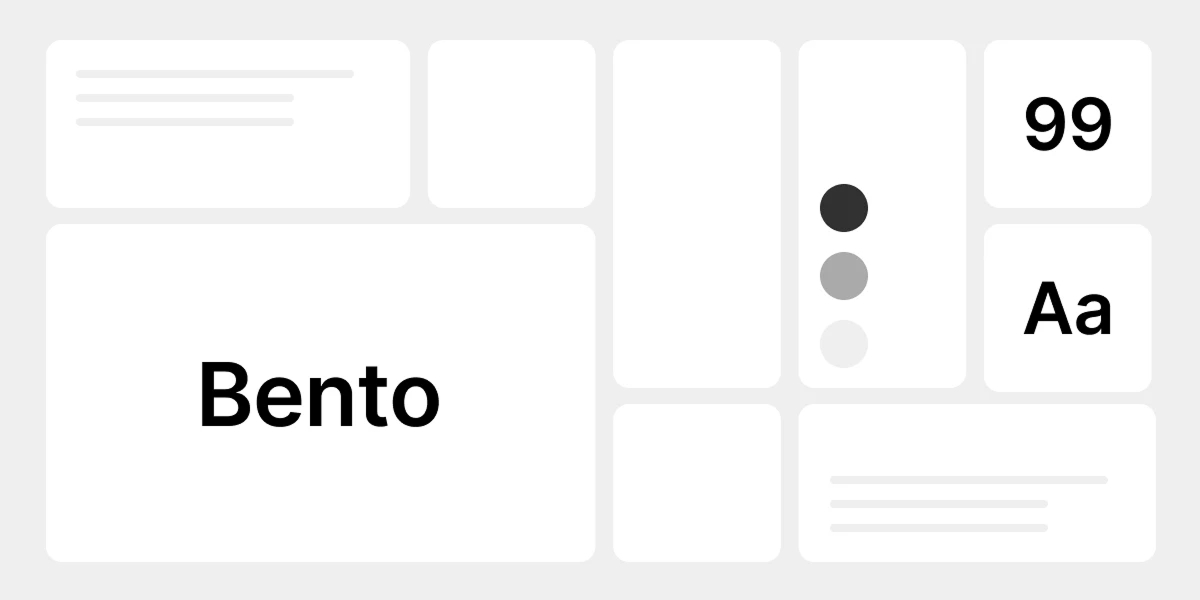
Here’s a simplified bento grid, styled the way it might appear on a fashion or lifestyle storefront homepage. Resize your browser window and watch how gracefully it adapts.
Summer Essentials
Lightweight fabrics, made for the season
Shop Now
Best Sellers
Shop the top 10
New Arrivals
Just landed this week
Notice how the largest tile anchors the whole composition, while smaller tiles support it with a discount, a review, and quick links, no traditional banner ad required.
Best Practices for Implementing a Bento Grid Layout
- Decide your hierarchy before you design. What’s the single most important message or product right now? That earns the biggest tile, everything else exists to support it.
- Limit yourself to 6–9 tiles. A bento layout loses its impact, and its hierarchy, the moment every tile is fighting for attention again.
- Keep spacing and corner radius consistent. A shared gutter width and border-radius across every tile is what makes the grid read as one composition instead of scattered boxes.
- Compress every image. Bento grids are image-heavy by nature. Serve responsive, compressed images (WebP where possible) so the layout doesn’t tank your load time or Core Web Vitals score.
- Design the mobile stack deliberately. Don’t just let tiles shrink, reorder and restack them so the most important content still appears first on small screens.
- Use motion sparingly. A subtle hover lift or fade is enough. Overanimating a bento grid makes it feel busy instead of curated.
Common Mistakes to Avoid
- Making every tile the same size. This defeats the entire purpose; clear hierarchy is the absolute point of a bento grid layout, not an afterthought.
- Overcrowding tiles with text. Bento tiles work best with one clear idea each: one product, one message, one call to action.
- Skipping accessibility. Color contrast, image alt text, and visible keyboard focus states all still matter, a beautiful grid that’s unusable for some visitors isn’t actually a good grid.
- Never testing on a real phone. A layout that looks perfectly balanced on a 27-inch monitor can collapse into an unreadable mess on a 375px screen if you don’t check it directly.
- Letting the content go stale. A modern bento grid layout is only as compelling as what’s inside it, an expired discount code or last season’s “new arrivals” tile undercuts the premium feel instantly. Treat it as a living section you refresh regularly, not a set-and-forget banner.
Bringing Bento Grids to Your WordPress or Shopify Store
Building a bento grid from scratch means custom CSS Grid work, careful breakpoint planning, and a fair amount of trial and error to get the hierarchy right. If you’d rather skip the guesswork, this is exactly the kind of layout we design directly into our theme collection at WP Bingo, modern, modular sections that give your store that same premium, editorial feel without writing a single line of code. You can browse our WordPress and Shopify theme collection to find a design already built around this trend.
Frequently Asked Questions
Is a bento grid layout hard to build?
Not if you’re using CSS Grid. A basic bento layout only needs a handful of grid-template-areas and a few tile classes. The harder part usually isn’t the code, it’s deciding on the right content hierarchy before you start designing.
Does a bento grid work for large product catalogs?
It’s best suited for homepages, category landers, and curated collections rather than an entire catalog view. For large catalogs, pair a bento-style hero section at the top with a traditional, uniform grid further down the page for full browsing and filtering.
Will a bento grid slow down my site?
Only if the images inside it are unoptimized. CSS Grid itself is lightweight and fast; the real performance cost comes from using excessively large, uncompressed images, so optimize image sizes.
Can I add a bento grid to any WordPress or Shopify theme?
In most cases, yes, as long as your theme allows custom HTML and CSS in a post or page, which the vast majority of modern themes do. If you’d rather not build it from scratch, choosing a theme that already has bento-style sections built in will save considerable setup time.
Final Thoughts
Adopting a cohesive bento grid layout isn’t just a passing design trend, it reflects something real about where e-commerce UI is heading: layouts that are intentional, hierarchical, and genuinely enjoyable to browse, rather than another uniform list of products. Stores that adopt it early aren’t just following a visual fad; they’re making their catalog easier to scan, their promotions easier to notice, and their brand feel measurably more premium.
Ready to give your storefront that same polished, modern feel?